Signed in as:
filler@godaddy.com
Your slide and/or your prop are more than just visual aids. They are powerful tools to enhance your message and leave a lasting impression. This week, we’ll focus on selecting visuals that will complement your talk and highlight the key points of your research. From choosing the right visuals to simplifying your content, you’ll learn how to craft a slide that draws attention and resonates with your audience.
Kelly Finke, a PhD student in ecology and evolutionary biology and winner of the 2023 Princeton Research Day, offers this perspective about visuals: “A lot of people want to put all their results on one slide. That just doesn’t add up. It’s so hard as a scientist to get rid of the details, but you have to be brutal. Give yourself permission to cut out the details and recognize [that] if someone needs to know the details [of this research], they can email me or catch me after the talk for more information.”
If you are competing in a GRC that does not allow slides, feel free to skip this week's tasks. Otherwise, please read it carefully because there is likely to be some advice that doesn’t align with (or may even contradict) the slide conventions for your discipline.
For those who are competing in a GRC that allows props, please feel free to scroll down to the prop sections.
To achieve your goals in Week 3, you will need approximately four hours to complete the exercises. This includes a buffer for tasks that take longer than estimated or for unexpected follow-up work:
Access Week 3 exercises here.

Most GRCs allow you one static slide to showcase years of research. How do you approach it?
In this section I will lay out what are generally regarded to be best practices for slide design. These principles are true for one or more slides and for static or animated slides. With that said, please know that disciplines have different conventions and expectations about what should be on a slide. If I were a gambler, I would wager that you (or your advisor) will disagree with something you are about to read.
I’m going to start with some theory so that when I make my practical recommendations, you will know why.
As humans, when we are exposed to a lot of information at once, we experience something called “cognitive load.” This phenomenon limits us from processing multiple streams of information at the same time. Think about when you are watching TV while scrolling on your phone. From a practical perspective you are doing both, but cognitively you are doing one or the other.
Get to the point, Marlit.
Why does this matter? It matters as you are designing your GRC slide(s) because best practices for slide design frequently contradict what we as academics want to do. Thinking that we want to make sure to share everything with our audience, we want to put as much text and as many images as possible on our slide.
But that is precisely what we should not do. (Reread Kelly’s advice above.)
Begin by recognizing that less content is better. It reduces the amount of cognitive load you are creating for your audience. Better yet, it increases the amount of information your audience will retain.
But Marlit, I need to put three graphs on the slides to show my results from my mouse experiments.
No, you do not.
Here is the thing: The temptation is to make the slide the center of attention. But the fact is that you are the star. Your slide is a backup dancer. So, how do you make sure it is the best backup dancer possible?
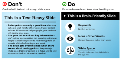
Here are a few best practices to follow as you design your slide(s). These principles are true whether you have one static slide or a longer animated slide deck:
1. Display one main idea on each of your slide(s). The focus could be the problem or the solution or something in between.
2. Limit your text to 6–10 words per slide. If the image speaks for itself, try no text at all. Unlike posters, you do not need to acknowledge your advisor or lab associates on a GRC slide.
3. Make the image(s) and font large enough to be visible and readable by those at the back of the room.
4. Choose image(s) that will not require too much explanation.
5. When appropriate, label the image(s) to help the audience know what they are looking at.
Let’s look at each of these principles a little deeper, and then we’ll see “before” and “after” examples of a GRC slide with notes about what works or does not.
Before we go any further, please draft the first version of your slide using Exercise 3.1.
(Time elapsing while you drafted your slide......)
Welcome back! Now that you have an initial prototype of your slide, let's discuss each of our best practices in terms of their rationale.

Yes, this limitation is as tricky as it sounds: What exactly is “one” main idea?
More often than not, when I see a scientific slide, there are too many ideas being displayed. Too much text, too many charts, no clear flow of content. Where am I supposed to look?
Don’t be discouraged if you are now thinking that your slide has too much text, too many charts, and no clear flow of content. Not to worry! Your main idea is very likely on that slide. Your job is to find it and place it in the spotlight.
For each element on your slide, ask yourself:
Do I talk about this element in my talk? If you do not talk about it, omit it. Charts and graphs often fall into this category because you never have enough time to explain the specific details fully.
Is this image visually informative? You have probably heard the expression, “A picture is worth 1,000 words.” It means that an effective visual image communicates much more information than we are able to deliver verbally and process intellectually. How much information does your image communicate? (Ask your test audience in Week 6!)
Does the slide’s content flow logically? In other words, does the content on the slide naturally guide the audience, or is there no clear order to the information? (To be clear, we want the former.) Ideally this focus would allow you to ask someone from the audience, “What is this slide about?” and they could give a succinct response about the one main idea.
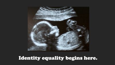
For academics, this guidance to limit your text is insanely challenging. Through our experience submitting to conferences and journals, we are governed by word and character counts. We have conditioned ourselves to write the maximum rather than the minimum. Make yourself choose the necessary words.
In the example on the right, I have extracted part of Pewee Datoo Kolubah's slide from his 2024 Falling Walls talk. In my opinion, this slide is effective because it displays a few words that are easy to read and it is accompanied by a map of Africa illustrating the breadth of the problem (i.e. access to electricity). Pewee's message comes through clearly because he couples the necessary words with an excellent visual to reinforce his message.
But how can we figure out the necessary words?
Someone will definitely disagree with me on the following recommendation, but if—and only if—you are verbalizing any jargon in your GRC talk, that word or expression would be a candidate for inclusion on your slide. The reason is that when we hear a new word for the first time, also seeing it on screen can make the word or expression easier to process. Keep in mind that in your script, you can also use alternative language for the term to explain its meaning.
Let’s consider an example.
Imagine we are attending a talk about “NMDA receptor antagonists,” an unfamiliar term to most. The speaker repeats this expression numerous times but does not have the concept (or the term) visually represented on the slide. Since we cannot view the words, our brain will try to untangle the spoken acronym, and then “receptor,” and then “antagonist,” and then the phrase as a whole. Without a visual cue on the slide, the audience is more likely to stop listening as they try to make sense of the jargon. However, if the speaker were to include that term on the slide somewhere, the audience would be less likely to completely tune out of the talk because they have now seen and heard the expression.
To clarify and summarize the above:
If you are able to deliver your talk without jargon, do that.
If you need to use jargon in your talk, limit it to one or two terms. Strongly consider including the term(s) on your slide so that the audience has two opportunities (i.e. visual and auditory) to absorb it.
Another way to think about limiting text on the slide(s) is to identify the unnecessary words. For example, you do not need a title or your name or any other metadata on your content slide. (Read that again.) Often, there is a separate title slide that precedes your main slide(s). Also, the names of all the speakers and their presentation titles are likely to be included in the physical program provided by the organizers at a live event. For a virtual event, these details are likely to appear on screen before your presentation.
.jpg/:/rs=w:400,cg:true,m)
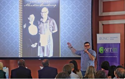
If you have ever been stuck at the back of a classroom or auditorium where you couldn’t read the slides, you know the challenge we are trying to conquer. The best way to manage it is to test the image(s) and the font size on your slide at different distances to confirm that the images and text are appearing as you intend. Looking at the example on the right, we can see that the speaker chose a large photograph that could likely be seen at the back of the room.
This guidance will vary depending on the size of the room where you will give your talk and the available technology. Is there one large screen? Are there multiple mid-size screens in the room? Try to find out the location of the preliminary round, which could be in a typical classroom, as well as for the finals, which are usually in a larger venue.
Pro Tip: If your competition will be held virtually, be sure to test your video recording to ensure images and font are clearly visible.
Another tricky one: An image that needs no explanation for one audience may need clarification for another.
Let's look at the image on the right. This is a slide that shows a lot of trash and debris on a beach. You may be wondering: How is this photograph a slide for a GRC? I'm delighted you asked!
When you look at this image, most people in the audience will have a quick understanding that the talk will address ocean pollution in some way. The slide does not create confusion about where to look or distract the audience with any hard-to-see elements.
The real message behind this advice for powerful images is that a general, non-technical audience will not understand the charts, graphs, or drawings that you want to use to display your results. If you doubt this advice, test it. Develop a slide with all those items and use it during your rehearsal with friends in Week 6. (If you do test it, you have to promise to use an audience that does not include your lab mate or similar individual who knows how to read charts/graphs and that the audience has your permission to tell you if they have no idea what those images mean. Promise?)
So, Marlit, how do I choose an image?
My first suggestion is to select a visually compelling image with something familiar to a broad audience. If you do research on the health of coastal ecosystems, consider an image of a polluted beach or injured marine life. If your research focuses on nanomaterials, perhaps you could display an image that compares the size of something most people know (e.g., a pen or cell phone) to smaller nanomaterials. If you study the culinary traditions of the Creek Native American Indians in the southern U.S., a drawing of a celebratory meal might be appropriate.
My next suggestion is to make the image big, maybe even the entire slide. Displaying a photo across the entire slide can be powerful, creating a different sensory experience for your audience than a slide with images and text. Depending on the image(s) you use, it may be appropriate to warn your audience that the image(s) could be upsetting or disturbing.

But Marlit, rule #2 was to limit text.
I know, I know. Sorry about that. It is a balance.
Here’s the balance: Have you ever attended a conference talk where you were trying to listen to the speaker and interpret the content of their slide(s)? I’m wagering that the answer to that question is at least a “maybe.” One technique you can use to help your audience is to clearly identify the image(s) with a short label.
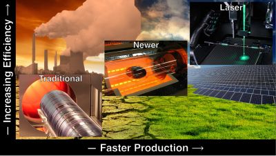
On the right is a 3MT slide from one of my former students. I found the original version, and it was filled with technical jargon crowding the slide. In this version, it is easier to see that the slide is actually a graph of various heating technologies, with the y-axis showing "increasing efficiency" and the x-axis showing "faster production". Instead of using the technical names of the heating technologies, the student chose simpler labels (i.e. traditional, newer, and laser) to reduce the cognitive load on the audience. (It's worth mentioning that I still have issues with the visual busy-ness of this slide, but from a label perspective, it does a good job.)
Okay, Marlit, but why are these teeny, tiny, nitty, gritty details important?
It all comes back to your audience. They will not be listening to you if they are:
● reading your slide because there is too much text
● trying to decipher the various images because they are poorly labeled
● struggling to figure out your message because there are numerous images on the slide
Some of you may be reading now and disagreeing with me. Good! I fully support differences of opinion and perspective. My only request is that you test your slide with your Fan Club and be open to their feedback when they mention you may have too much content on your slide. :-)
Pro Tip: Your test audiences will be able to help you know what elements on your slide would benefit from a label and which ones are self-explanatory and do not need extra labels.
In the image to the right, this is a scientific slide. (Click here for larger version.) I'm sure you have seen similar ones filled with small text and crowded with visualizations. Let's critique this one as we review our best practices:
1. Given the volume of content, we can assume that there is probably more than one idea.
2. There are too many words on the slide, most of which cannot be read from a distance.
3. While you could argue there are big elements (maybe the photo on the left and the schematic drawing on the right), there is not one central image that clearly captures our attention.
4. The one photo present is not a powerful image for me.
5. There are labels on the visual elements, but again, they are quite difficult to read.
In the context of our current discussion around GRC slides, you can see that the slide violates most of the recommended practices.

Let's take a look at a modified version of the slide. (Click here for larger version.) In the image to the right, we can see a large image of a turbine engine focused on the blades. While not a visually appealing work of art, this slide aligns better with scientific communication principles, making it easier for most audiences to process. Let's analyze why.
1. The content is limited to a large image and a statement that is nine words in length. This makes it easier on the human brain to process.
2. There are 15 words on the slide, which is arguably too many. However, they are in large font and plain language so the audience does not have to work as hard to understand.
3. The photo of the blades clearly stands out as the focus of the slide.
4. While this photo is not visually exciting, because it is so big, it really helps clarify what the slide is about.
5. There is one clear label describing the photo.
I hope this example helps distinguish what makes a slide more or less effective.

Feel free to skip this information if your GRC does not allow props.
Some GRCs will allow you to use a prop as a part of your talk. A “prop” (short for “property”) is an object that you bring on stage with you to enhance your talk. An effective prop should be tightly coupled with your research narrative, make the message clearer than if there were no prop, and serve as something for the audience to remember.
In his 2024 Falling Walls talk, Pewee Datoo Kolubah, a chemical engineering PhD student from the King Abdullah University of Science and Technology in Saudi Arabia, used a prop to help explain his research on a new battery that can store more energy than other types of batteries. He could have chosen to talk about the battery and/or show a picture of it, but he actually brought the battery to the stage as part of his presentation. As a member of the audience, I felt my understanding expand when I saw the device. The benefits of props are that they can provide your audience with a more immersive experience than by using a slide(s) only.
Constadina (Dina) Rogers is a doctoral student in biochemistry and molecular biology at Dalhousie University in Canada. Dina conducts research on how to reduce plastic accumulation, a global environmental problem. At Falling Walls 2024, Dina explained the technical details of leveraging a bacteria derived to degrade plastic, and then she demonstrated the act by dropping a small piece of cotton candy into water at which point it dissolved instantly. Using this prop to make her research visible to the audience was highly effective. Not only did it garner immediate applause from the audience, she also won first place in the competition.
Props also have a few potential risks. One risk is that you must decide and practice how you will interact with your prop on stage: When will you use it? For how long? Where will you place it when you are no longer referring to it? Another risk is that the audience will not understand how it relates to your research. Avoid frivolous or funny props because they may confuse your listeners.
To choose an appropriate prop, ask yourself the following questions:
If you can answer yes to all of those questions, (and, of course, if your GRC allows props), then have fun adding a prop to your talk!
In summary, a prop to accompany your GRC talk can be an effective tactic. A few ideas for props include models of physical structures, equipment that you use in your research, historical documents, or a jar of sand or other natural material. As you watch the GRC talks in the exercises, watch for clever uses of props.
Exercise 3.1 will help you brainstorm options for your prop.

If you are wondering whether you should pass your prop among the audience, think about your specific GRC and the time allotted to your presentation.
Given the typical time limit in a GRC, passing the prop around the room during your talk may not be very practical because by the time your prop gets around the room, your talk would likely be long over, and three other speakers will have finished their talks!
What’s even worse is that if your prop was being passed around while competitors were speaking, you would have unwittingly distracted the audience from your competitors. I think we can agree that you would not appreciate it if someone interfered with your allotted time.
There are two other reasons you may not want to pass your prop through the audience:
Here are the key takeaways from Week 3:
1. Slides and props should support you, not compete with you.
Your slide or prop is a supporting tool, not the star. Keep the focus on yourself and your message. A clear, well-chosen image or object can enhance your impact and make your research more memorable.
2. Less is more. Simplicity boosts clarity and retention.
Avoid cluttering your slide with text, graphs, and multiple ideas. Limit text to 6–10 words, focus on one main idea per slide, and eliminate non-essential visuals. Too much information increases cognitive load and diminishes audience understanding.
3. Choose visuals that are intuitive and readable.
Pick images that are visually informative and large enough to be seen from the back of the room. When needed, use short labels to help clarify the image. Avoid visuals that require complex explanations.
4. Use jargon sparingly and only with visual cues.
If technical terms are necessary, limit them to one or two. Include them on the slide if they’re verbally used. Seeing and hearing the term helps audience comprehension.
5. Props can be powerful—but only if they’re purposeful.
A good prop should be directly related to your research, be easy to use and to carry on stage, be clearly visible and easy to explain, and not distract from your talk.
Check out the Week 3 Checklist and reflection questions. See you in Week 4 to work on your presentation skills!